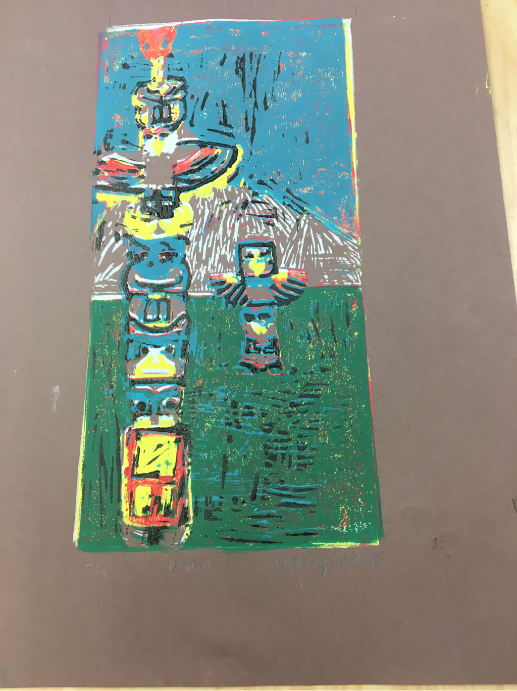
 My Print is not well crafted the in some parts I did not carve deep enough. Also the ink coverage is poor in some areas you are able to see colors underneath that you are not supposed to. The registration is ok most of the prints are within the marks though slightly crooked. I did not use as much texture as I would have liked to but I did include texture in the mountains. Also wth my errors it added texture to the grass. The colors I choose look very well together and use the common totem pole colors for Native American culture. I think I could have added a third totem pole to balance the peice more. If I could redo the project I would carve out cleaner lines and line up the prints more evenly on top of eachother.
0 Comments
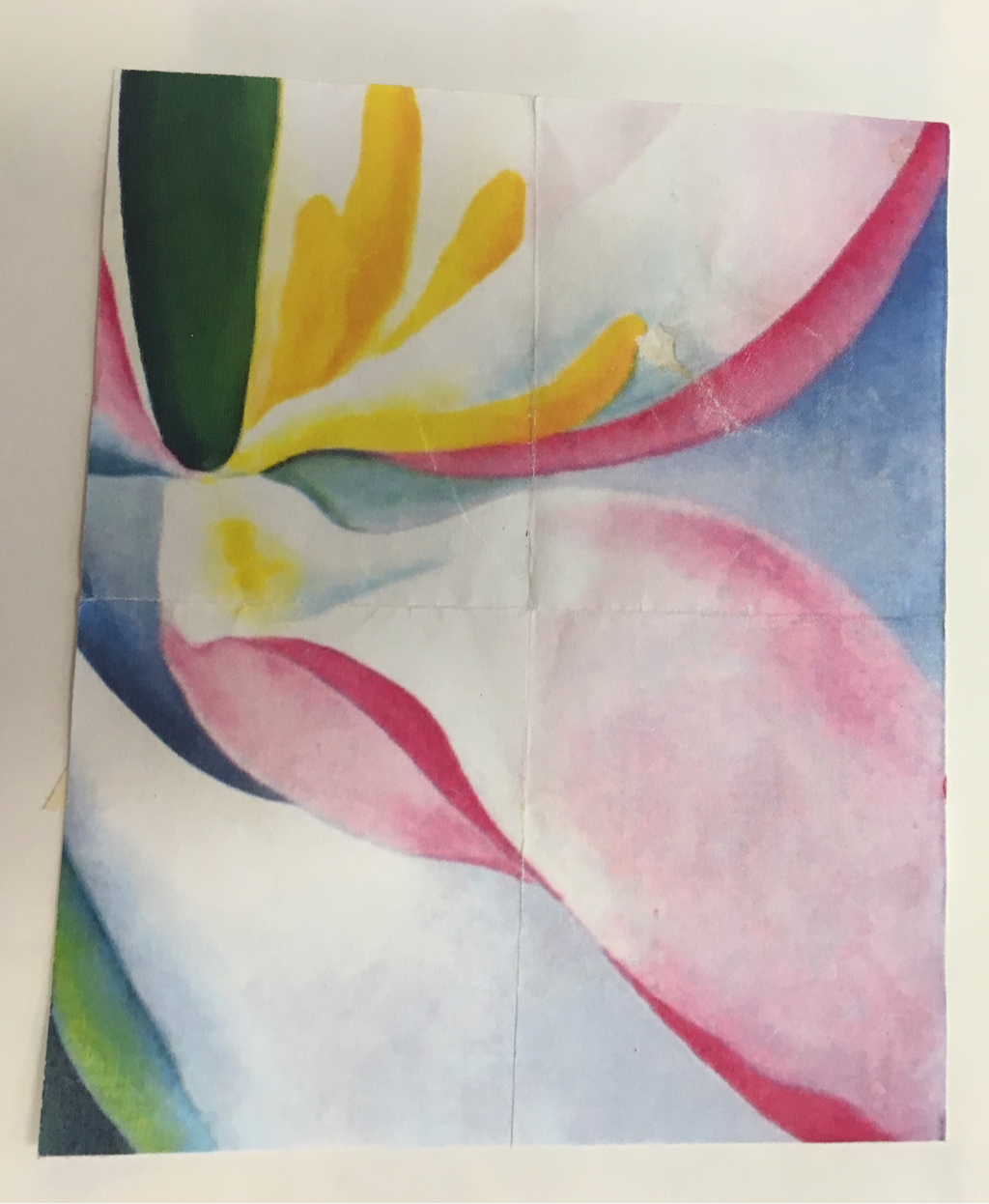 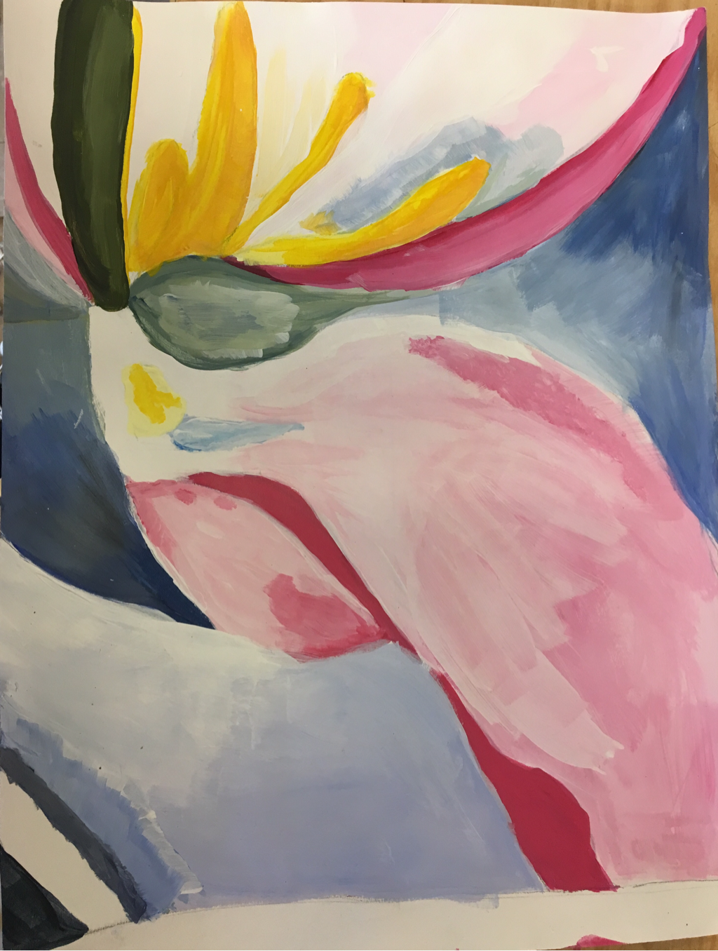 This is my copy of the painting I was given I really tried to get the right tones of the painting and values. I probably could have blended it better though.
  Joan Miro:
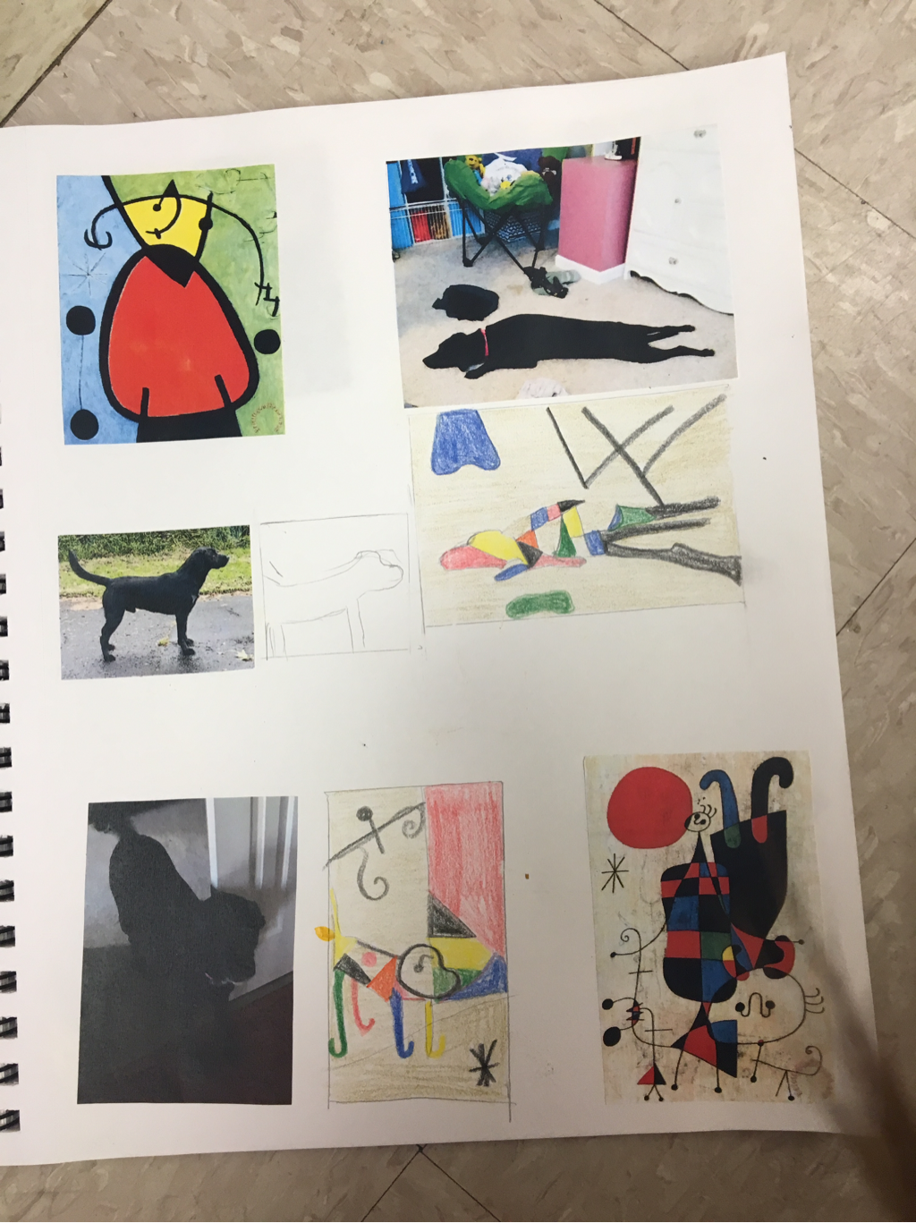
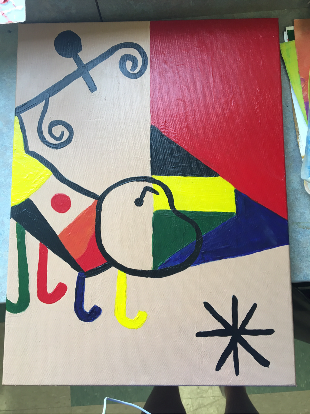
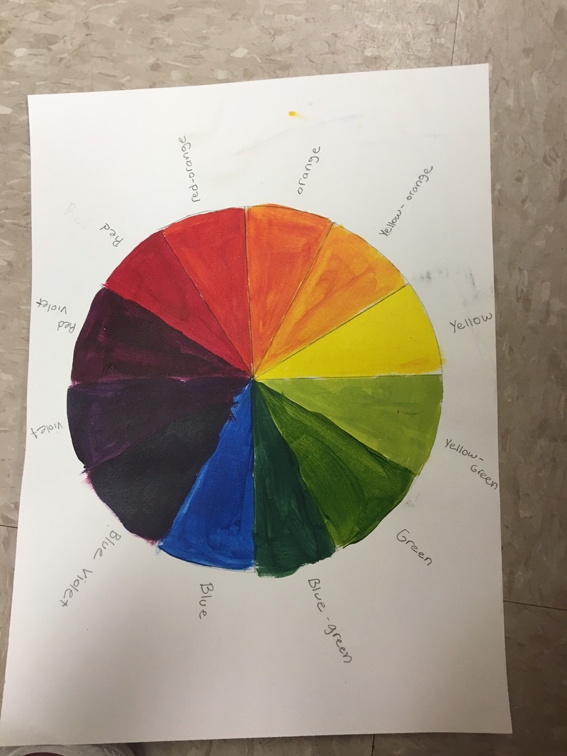
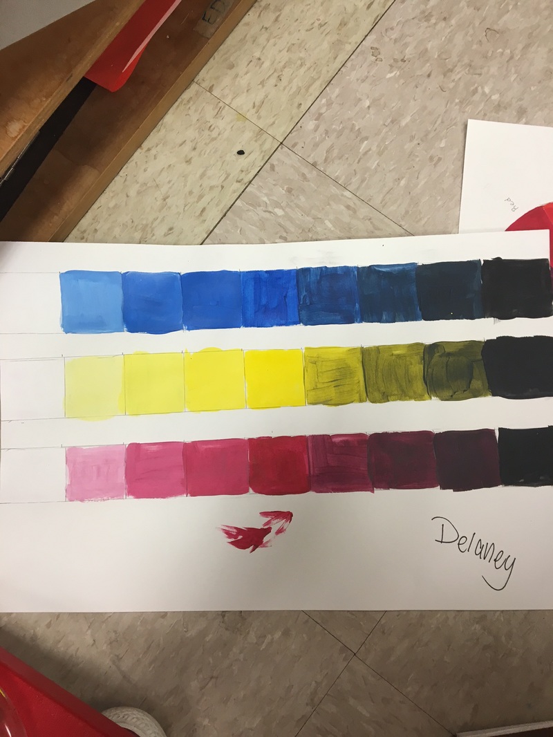
1) Use of one shade of each color you use (limited palette) 2)Use of simple irregular shapes 3) Painted landscapes or common object 4) Used a Single medium My painting is neat and well executed except for doing to thick of layers on some of the colors that it now looks a little clumpy. The most difficult part of this project was the layering and building them up to make them as bold as Miro did. The choice to use few colors and very bold colors reflects Joan's style as an artist. I did a common object a dog which is somethin Miro would have painted. If he could see my painting he would say it is a good concept but make the black lines sharper. If I did this project again I would take more time to let the layers dry in between. This is my color wheel i made the colors by mixing the primary colors. I also made a shade and tint chart mixing black and white into the primary colors.
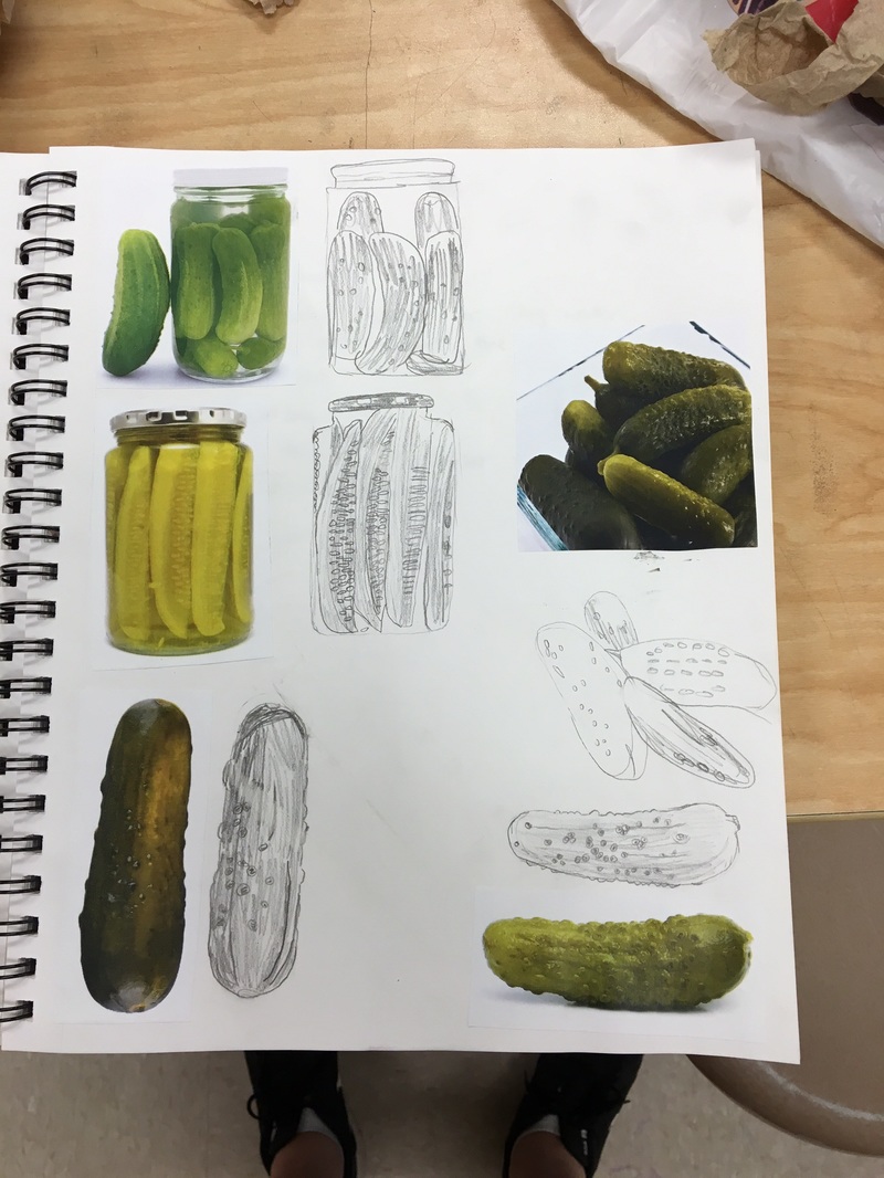
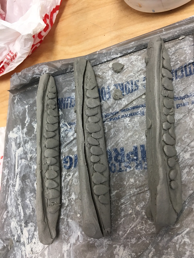
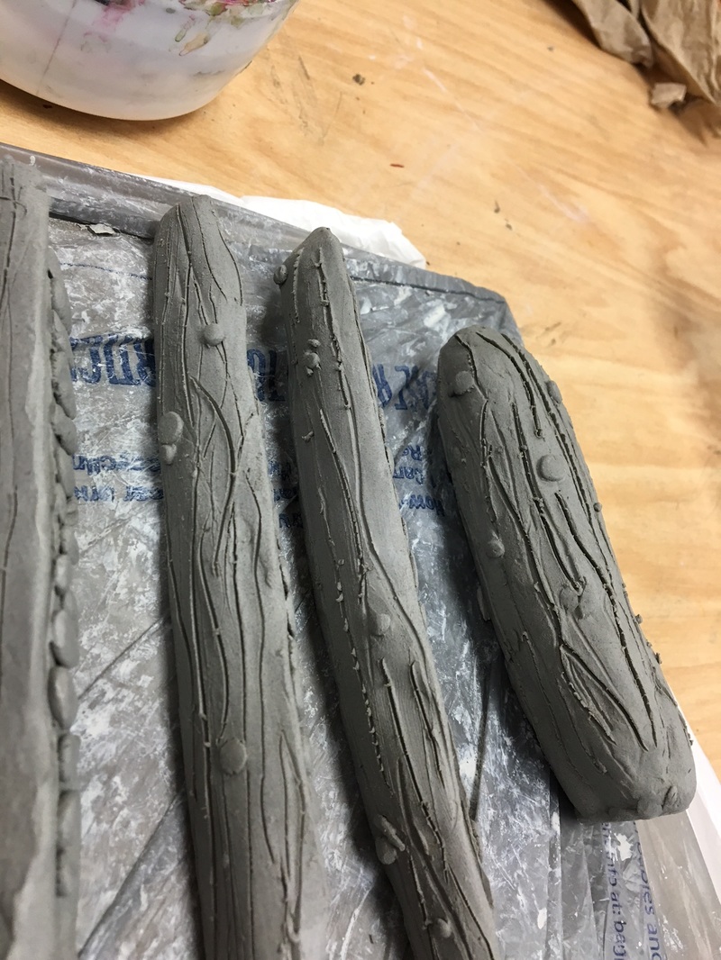
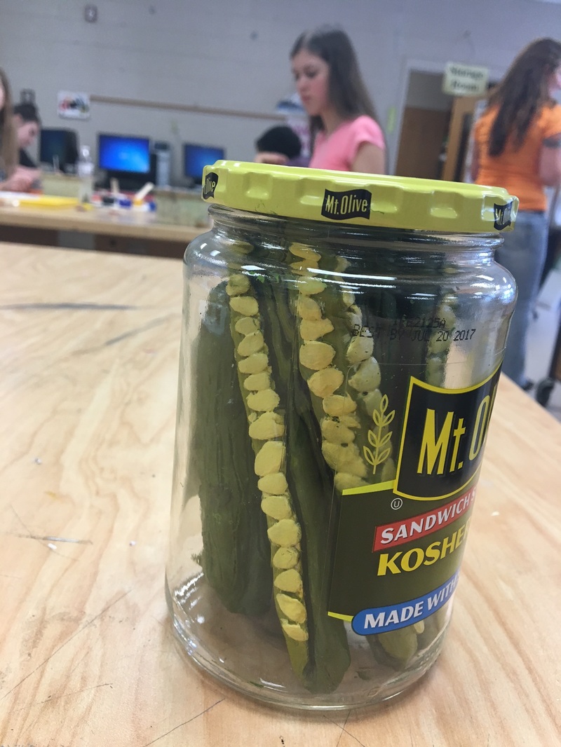
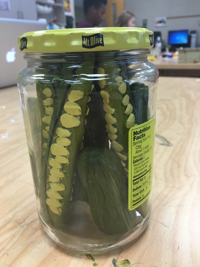
My sculpture is very well executed it came out better than I thought. The hardest part was creating the hallow pickles and getting the right shape. The pickle slices look good from a angles while the whole picked do not look good from the bottom because I had to hallow them out. Crating a sculpture is different than creation a 2d peice because in a sculpture you have to think of how it will look from every angle where 2d art you only have to create the parts you want to see. I created texture by adding seeds with extra clay and I carved out lines in the outside of the pickle. The colors I picked worked really well together I used 4 shades of green using a different one on different parts of the pickle to make it look realistic. I think my clay looks just like the a real pickle and the jar adds to how realistic it looks. If I did this project again I would not do a whole lot differently I love how they turned out I would however change how I hallowed out the whole pickles so make a cleaner hole.
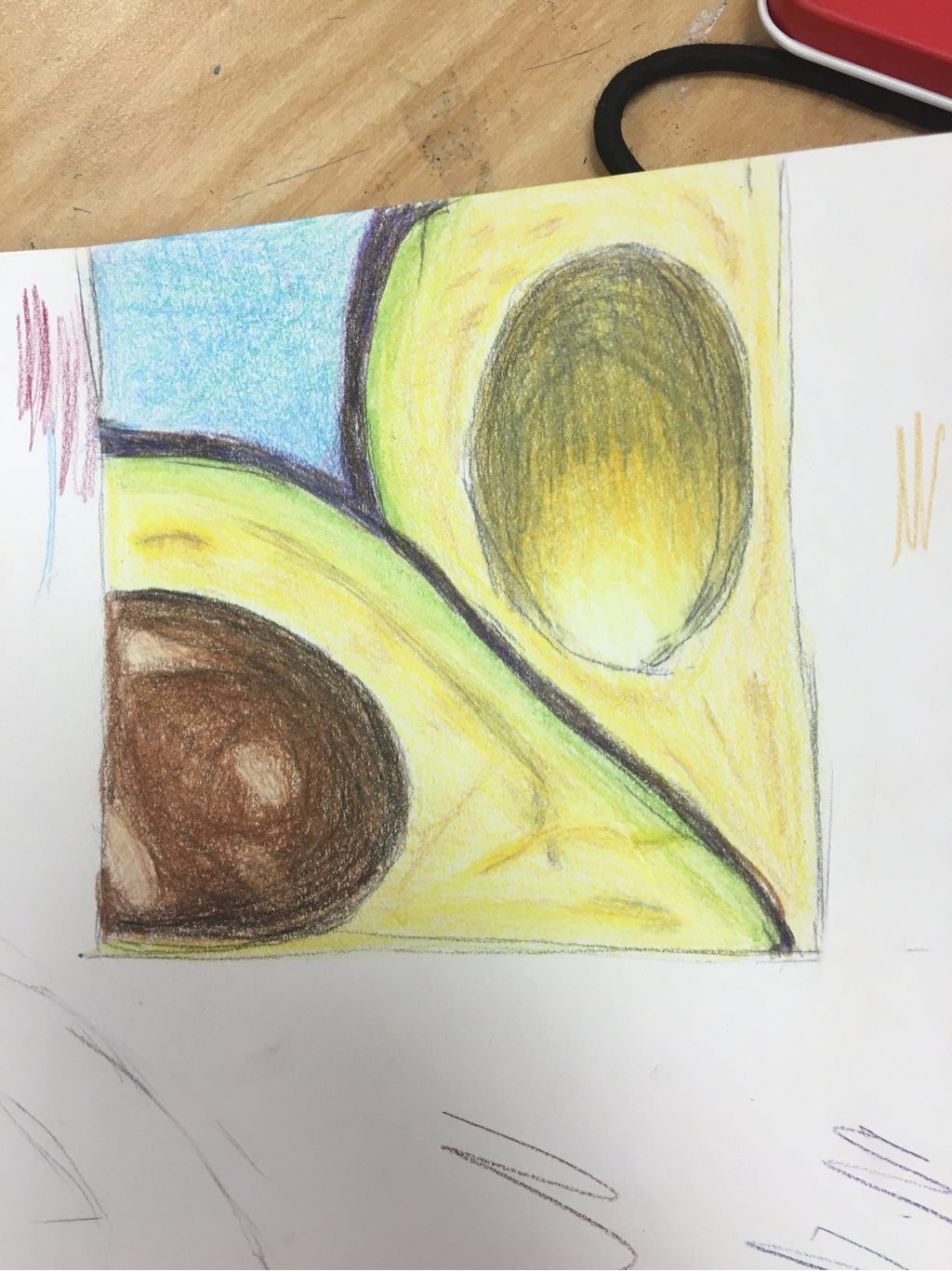
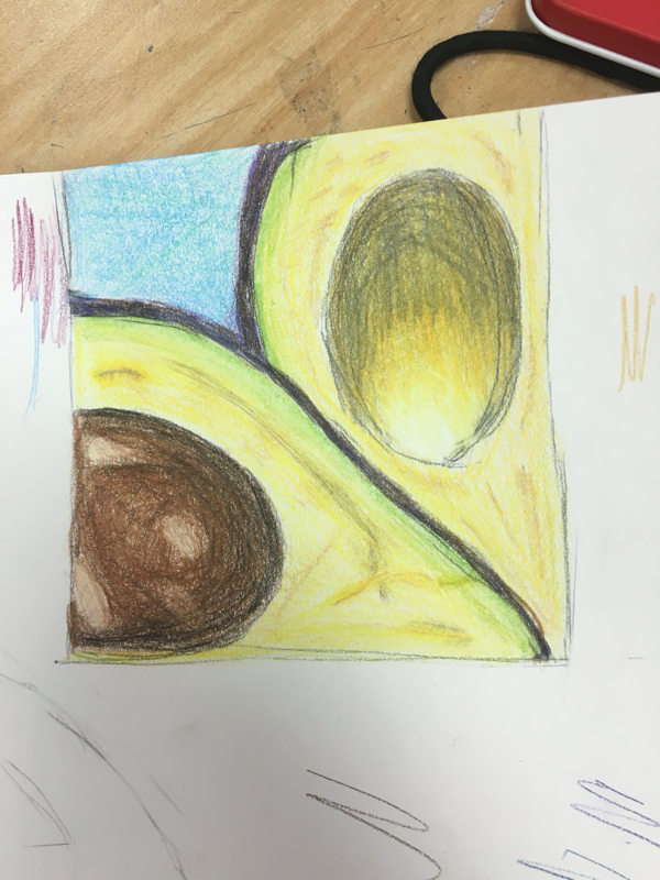
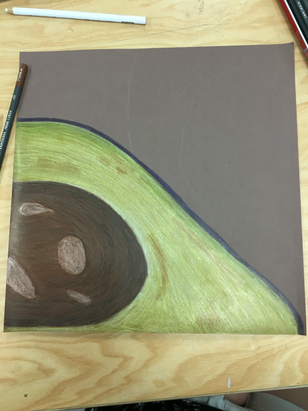
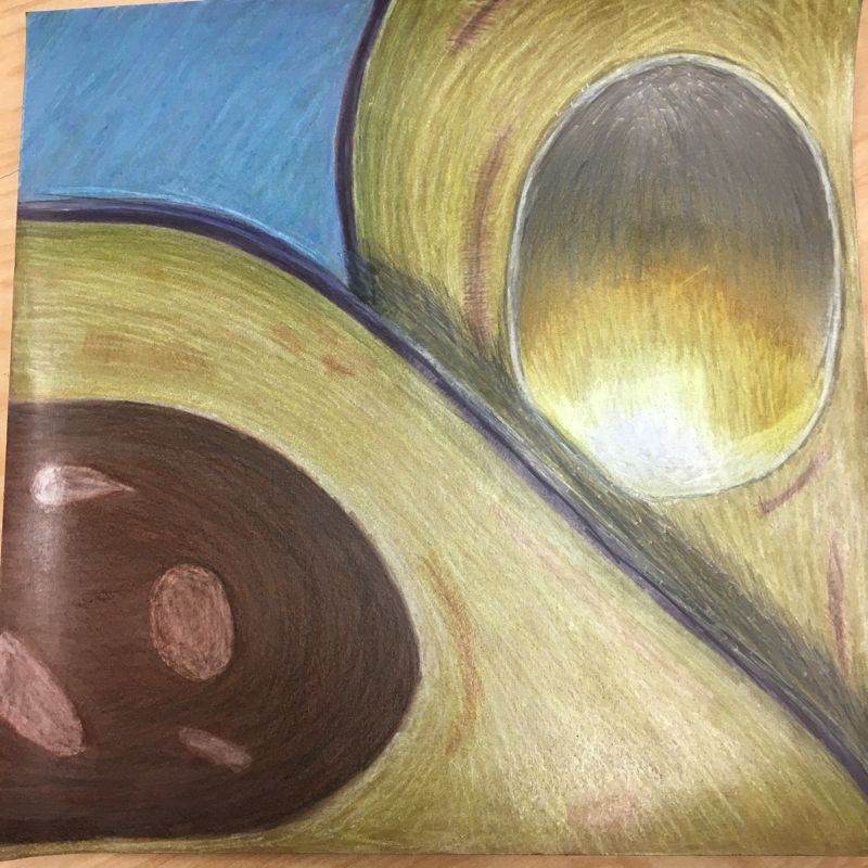
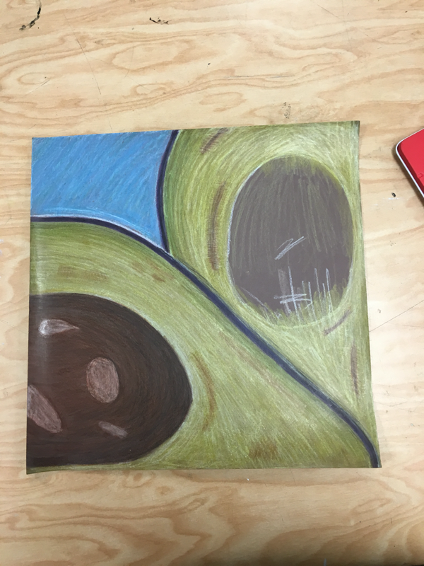
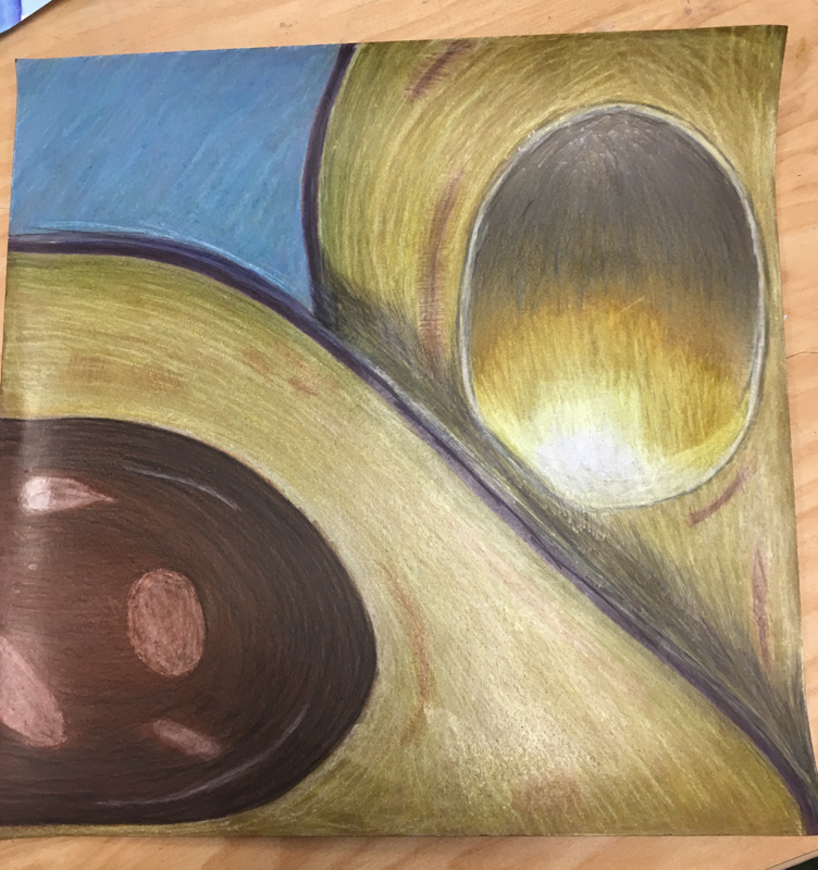
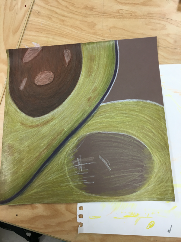
I think I had well developed craftsmanship. And that I made a nice cohesive piece. I used full range of depth and illusion by an ding shadows and textures throughout the piece. This represents O'Keefe's style because it is an up close drawing of something in nature. I used lots of different shades of colors such as yellow, brown, blue, purple, and a small amount of green. Using the blue background allowed for the piece to flow and be cohesive. I used white to show highlights in the pit and black on it to show depth of the shape. I added white and layering to the hallow part of the avocado to make it have a hallow look. I was able to show texture of the avocado grain and add in some brown to show aging spots. I also used shadow behind the first avocado to make it look like it is overlapping the 2nd avocado. I showed contrast by adding purple to the peel and blue ass the background. I was hard to make the grainy texture and to make the colors vibrant so it did not look washed out if I could change something I would change the shadow behind the first avocado.
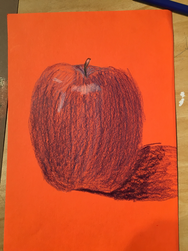
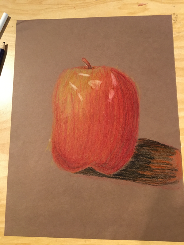
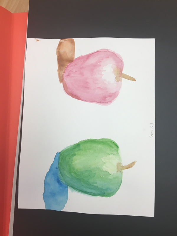
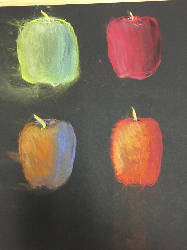
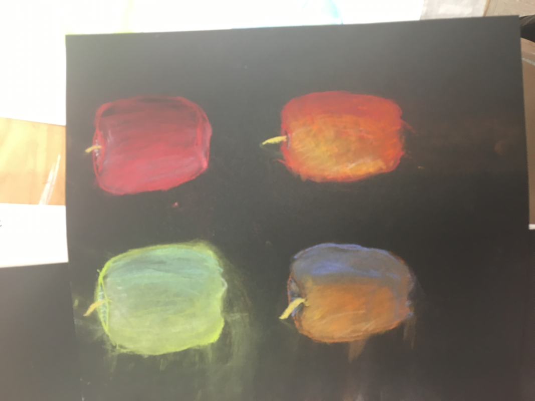
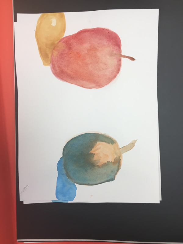
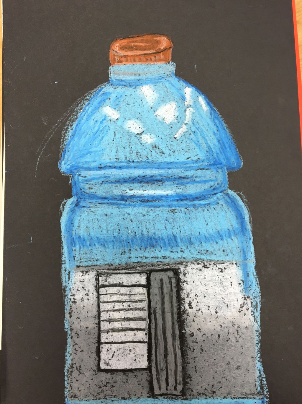 these are apples done in value with the different mediums chalk, colored pencil, and water color and a Gatorade bottle in oil pastel
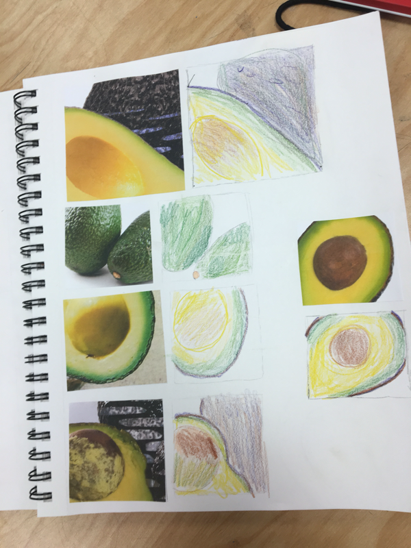
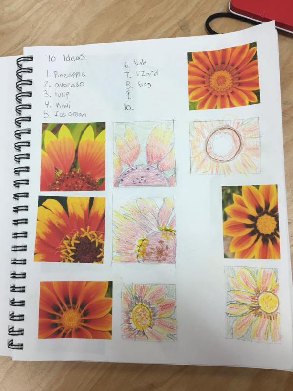
  My idea for this project was to do a flower or an avocado 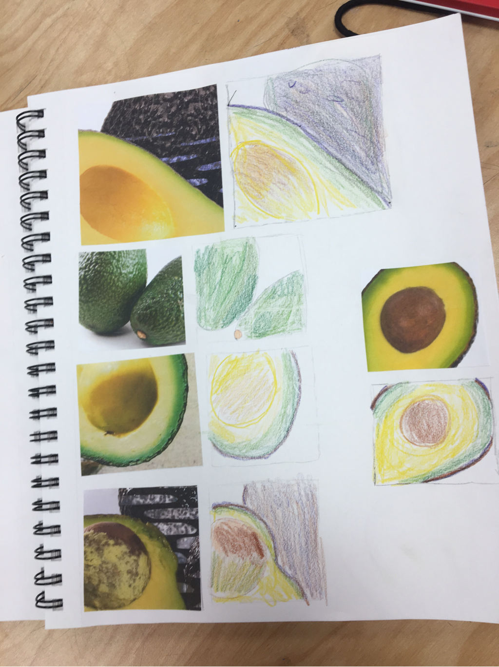 This is drawings of apples using the different mediums chalk, colored pencil, and water color
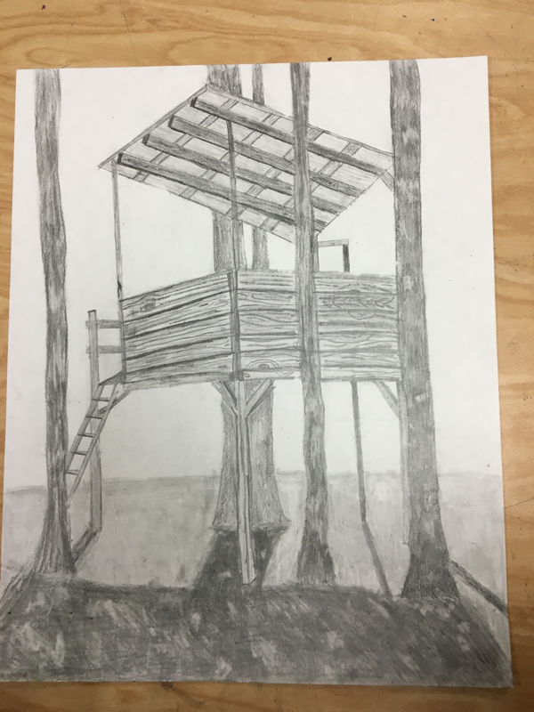
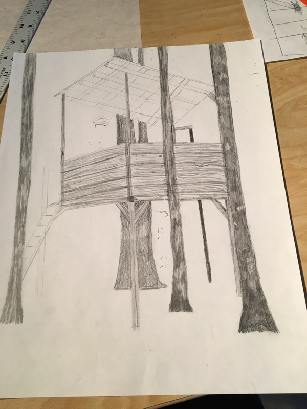
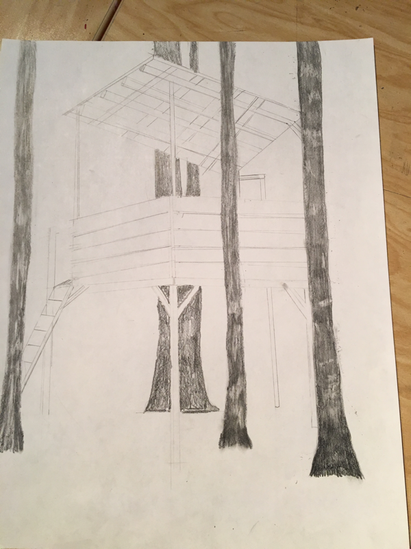
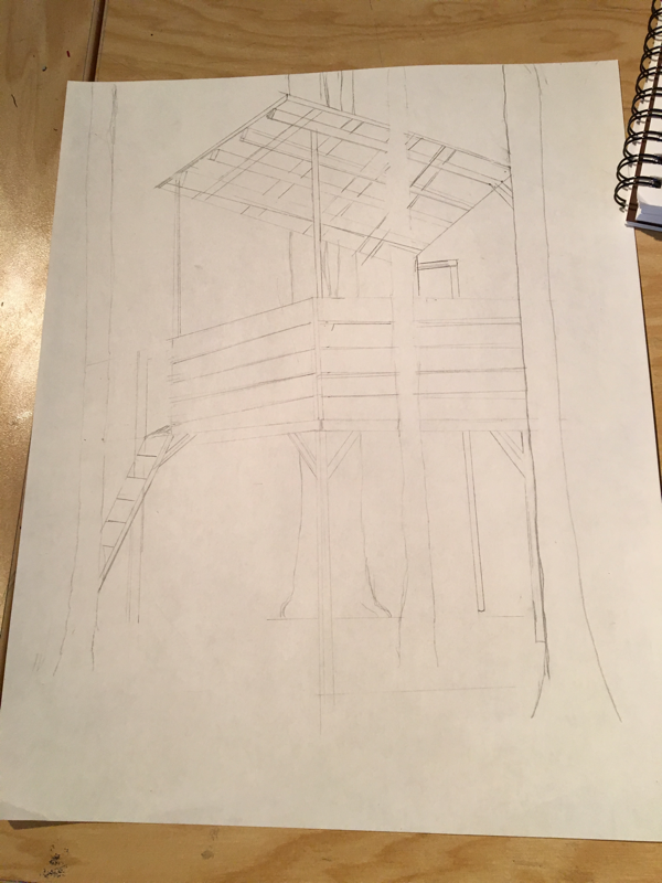
I chose to use pencil because I am more comfortable with it because you can't erase pen. Texture is important in this peice to show the bark of the tree and the wood grain of the tree house. Value is important in this peice to show shadows and add to the overall 3D look. I used correct prospective buy using the same vanishing points. I showed depth with the texture of the trees and by using my different shading technique. The mini lessons were helpful to learn one point, two point, and three point perspective to butter understand my ability going into the final project to know what I would be able to accomplish. I feel that my project could have been cleaner but I was surprised at how well it came out. If I could recreate my final peice I would focus on the texture of the ground to enhance it. I think going forward I will pick things to do that are a little more challenging for myself.
|


 RSS Feed
